Learn Some CSS and Stuff with the Redesign of Barbarian Meets Coding
Twice have I tried to redesign this blog, and twice have I failed miserably to do it. Yet from the ashes like the Phoenix of old shall I rise and attempt it… one more time.
This time, unlike in the past, I am going to try an iterative approach, I am going to take it in small steps, slowly but sure, changing, re-desining, re-shaping, re-defining and pushing these changes every week. And I thought to myself, why not share it, publicize it, so you may learn as I myself do?
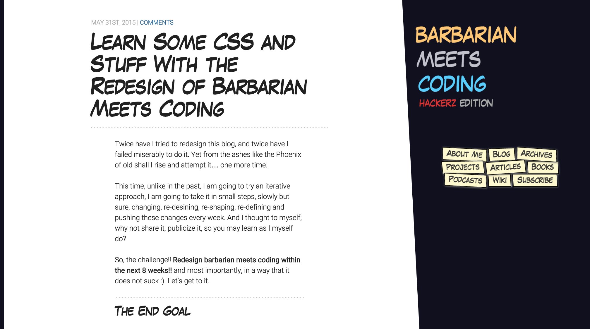
So, the challenge!! Redesign barbarian meets coding within the next 8 weeks!! and most importantly, in a way that it does not suck :). Let’s get to it.
The End Goal
Because it is always important to start with the end goal in mind and visualize what you are trying to achieve and how will the end result look like, let’s try to put it into words. I want to redesign barbarian meets coding:
- so it emphasizes the content, removing all extraneous distractions and unnecessary details, which feels like a simple, minimalistic design as I write these lines
- yet I want it to have personality, so I need to temper minimalism with… warmth? humor? something?
- it should be interactive, inviting, with subtle cues and the finishing touches that make every piece of craftsmanship and labor of love remarkable
- and finally it should render beautifully in every device of any shape and proportion
For the personality part I decided to go for a comic theme, following the barbarian part of barbarian meets coding and the influence of Conan. Let’s see how it panned out.
The Plan
Since most of you use a desktop to read this blog I thought it would be sensible to start redesigning the desktop version first while I keep the mobile version as it is today, and face one problem at a time. I started doing some sketches about what the result might look like:
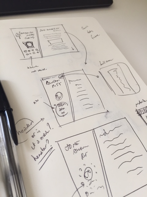
And devised a plan of attack (this is taken straight from my to-do-list):
* MVP
  * startpage
    * header/sidebar
    * navigation
    * subscribe
  * content/articles
    * improve readability
* Improvements
  * startpage
    * header/sidebar
      * conan background with opacity gradient?
      * increase size on hover of all anchor tags?
      * use floats instead of inline blocks in main menu?
    * navigation
      * add RSS
      * add search
    * content area
    * social
    * current
      * books reading
      * twitter, etc...
      * working on
  * Do something about the size of images. Optimize all of them. Find a nodejs tool or something to fix it permanently
  * blog/article views
  * archive
  * Mobile site
  * Tablet site
  * smaller improvements
    * good description in every page (like beginning of article)
    * hierarchy of navigation
    * optimize mobile experience
Where I defined an very teeny tiny MVP to get started pushing changes as soon as possible and which results you can see right here when comparing the previous version:
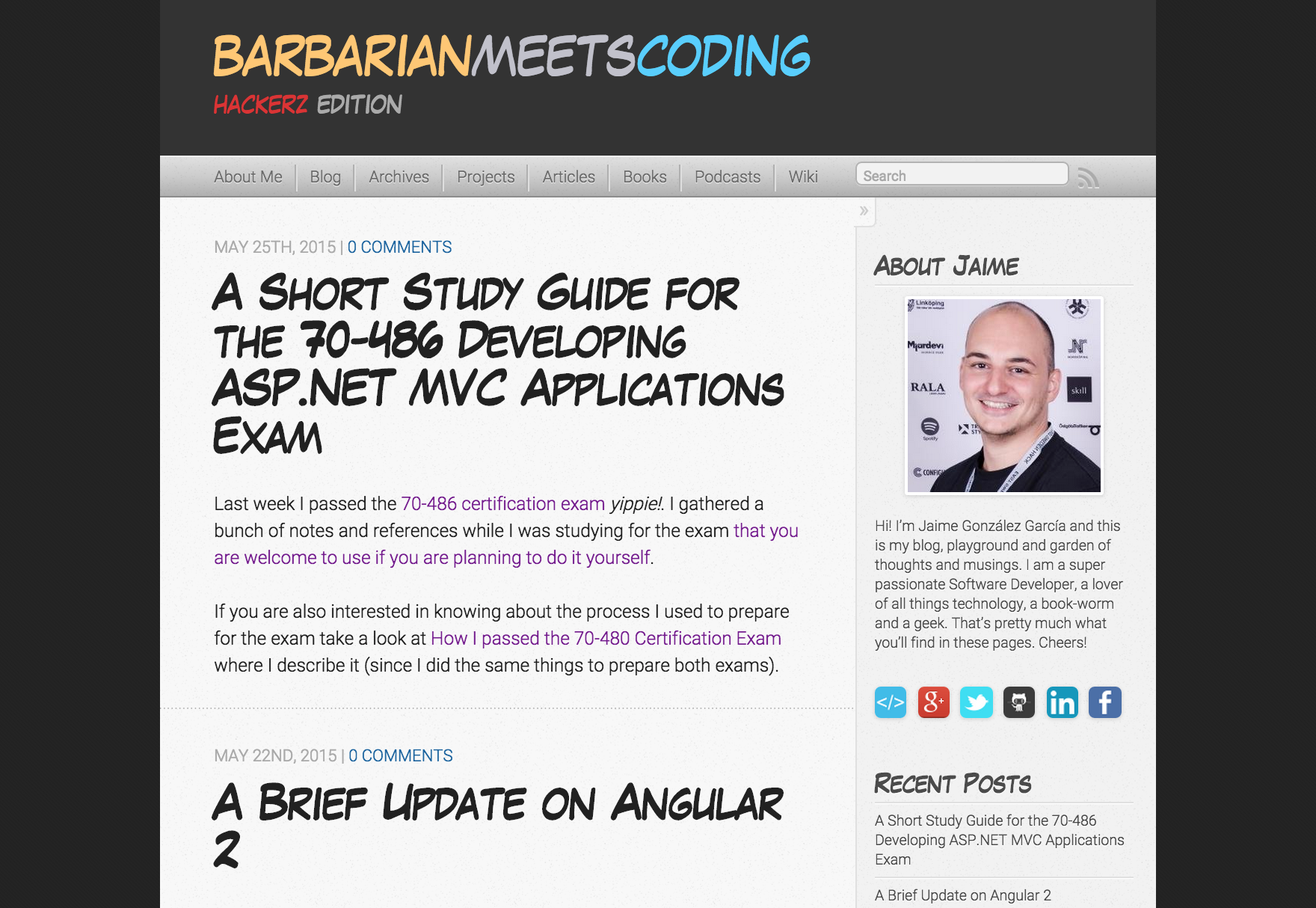
with the blog start page:
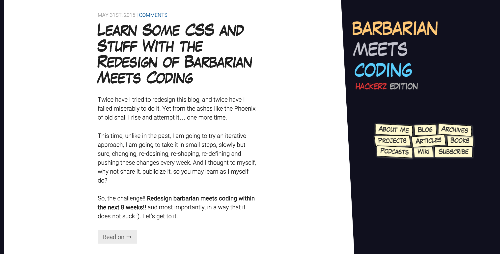
and an article:
Starting With Desktop
Since I am using Octopress’ built-in theme and I am planning for a major redesign I decided to start little by little overwriting all the styles :). I defined some breakpoints for my media-queries:
/* responsive */
$palm: 500px; // two high break right now, will need to fix in the future to around 480px
$lap-and-up: $palm + 1;
$lap: 800px;
$portable-and-up: $lap + 1;
$desk: 1092px;
$desk-and-up: $desk + 1;
$big-desk: 1500px;
With these media-query break points I could effectively apply styles for non-mobile devices only and leave the mobile part untouched. I started styling the new sidebar/header using most of the same selectors that Octopress itself uses:
/* Tables and Desktops */
@media screen and (min-width: $lap-and-up){
/// styles
}
The new header/sidebar is just a fixed header which a css transform to make it look a little bit skewed:
    body > header {
        background-color: $header-background;
        box-sizing: border-box;
        width: 35%;
        height: 100%;
        position: fixed; // position element fixed in relation to the browser viewport
        top: 0;
        right: -5%;
        padding: 30px 5% 10px 20px;
        transform: skew(3deg); // skew by 3 degrees
        z-index: 1;
I removed a lot of the stuff from the sidebar - my photo, social links, twitter feed, books that I am reading, etc - and left only the strictly necessary which is to say the main navigation of the site. Since I wanted to give it a “comic” feeling I designed each navigation item like a comic callout (I’m not quite sure that’s the actual name but you’ll get it when you see them):
// note that I removed some styles to highlight what I am writing about
nav {
    .main-navigation{
        li {
            display: inline-block;
            padding: 2px;
            background-color: $comic-label-color;
            border: 1px solid black;
            box-shadow: 1px 1px 5px grey;
        }
    }
They are displayed as inline-blocks so they wrap nicely. To give them an even more comic-y look I rotated each of them in arbitrary ways using transforms:
// note that I removed some styles to highlight what I am writing about
nav {
    .main-navigation{
        li {
            &:first-of-type{ transform: rotate(3deg); }
            &:nth-of-type(2){ transform: rotate(-2deg);}
            &:nth-of-type(3){ transform: rotate(4deg);}
            &:nth-of-type(4){ transform: rotate(-1deg) skew(4deg);}
            &:nth-of-type(5){ transform: rotate(-4deg);}
            &:nth-of-type(7){ transform: rotate(3deg);}
        }
    }
And on hover I added some extras. My initial idea was to increase the size of the items with a css transition but since each item is an inline-block they started reordering themselves resulting in accute self-murdering feelings on my part, so I removed them xD (although I may add them in the future…)
        a {
            transition: color .4s, font-size .4s;

            &:hover:before{
                content: '[';
                // so the pseudo element doesn't take any space
                position: absolute;
                left: -1px;
            }

            &:hover:after{
                content: ']';
                // so the pseudo element doesn't take any space
                position: absolute;
                right: -1px;
            }

            &:visited{
                color: $text-link;
            }

            &:hover{
                color: #0181EB;
                // commented out because I haven't made it work yet XD
                //font-size: 1.01em;
            }
        }

    }
After having a passable sidebar I did some small changes in the content itself, increasing the white-space in general, and the size of the headers when you are reading a single article. Moved the social links to a less prominent place within the signature of each article:
And added some new basic styles for the images:
/* Images */

.comic--rotated-right {
    transform: rotate(1deg);
}
.comic--rotated-left {
    transform: rotate(-1deg);
}
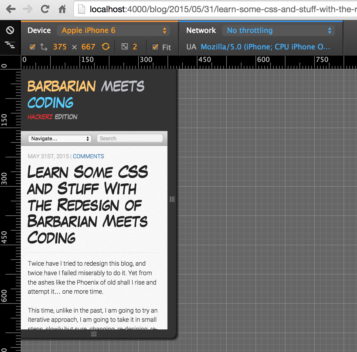
Finally, and as I mentioned before, I haven’t touched the mobile part yet. And so if you reduce the width of the screen the old styles (Octopress’ built-in theme) will reveal themselves before your eyes:
Concluding
And that is as far as I got this time. Hope you have enjoyed this look behind the scenes and learnt some CSS at the same time. Come back to you next week with more design stuff!

Written by Jaime González García , dad, husband, software engineer, ux designer, amateur pixel artist, tinkerer and master of the arcane arts. You can also find him on Twitter jabbering about random stuff.
