3 Things I Learned From Seductive Interaction Design, Creating Playful, Fun and Effective User Experiences - A Barbaric Book Review
With Barbaric Book Reviews I bring you interesting reviews and useful insights from awesome books that I have read. I also bring myself the magic of everlasting memory so that I don’t forget these tidbits of knowledge as I grow old and wither.
I should read more UX books. We! [Developers] should read more UX books. They are filled with wondrous jewels of information about the arcane arts of psychology and human behavior, of inestimable value when crafting effective and engaging user experiences. They are also beautiful, I haven’t seen a UX/Design book that wasn’t in itself a wonderful and inviting artpiece of a book. (ehrr… Jaime, always sooo enthusiastic)
We recently started a book club and a library at work. In the book club we read a book a month and afterwards we discuss it (cool), in the library we have shared our books with each other for the betterment of the Universe and for great justice. That’s how I got to borrow this great book titled Seductive Interaction Design: Creating Playful, Fun and Effective User Experiences by @stephenanderson from my good friend (and UX whiz) Erik Claesson and Voilà! The article!

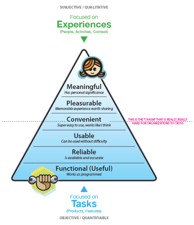
Seductive Interaction Design explores what lies beyond usability and takes us to the realm of emotions, that is, how can we design applications and services that are not only easy to use or convenient but pleasurable and meaningful. How can we design applications that can elicit an emotional connection in our users. How can we design applications that entice or seduce our users from the very first sight and into a long lasting relationship.

The setting is the Odenplan Metro Station in Stockholm, but we could easily be in the subway in New York or the Tube in London. There’s an escalator running next to a set of stairs, both leading up into the daylight. Only today something is different. An experiment is taking place. The stairs seemingly have been transformed into piano keys. Not only do they resemble the familiar black-and-white keys of a piano, but through the magic of technology - sensors attached to speakers - every step triggers the resonant sound of a piano key.
We watch as two people start to take the escalator, pause, then place a foot on the first step. A low, loud note rings through the station. They each take a few more steps, caution transforming into more of a leap in their step. The air is filled with the sound of a musical scale. We see more people approach, just curious at first, but soon the are delighted. For some people the goal is no longer to even exit the station - they step back and forth across the keys to create a melody.
What is going on here?
This is an experiment in behavior change: “Can we get more people to choose the stairs by making it fun to do?”
In summary, the book describes how to create applications that delight our users - like the piano staircase delighted all passers-by - and that lead them to behaviors of our own design - to make the healthy choice and choose the stairs instead of the mechanic ones. It does so, in a very clever way, by drawing a parallel story to the art of human seduction in four parts:
- Aesthetics, Beauty and Behavior describes the importance of aesthetics and beauty, and enumerates a series of attributes that human beings find attractive. If it works with humans and is ingrained in our nature, why not harness that knowledge when building attractive applications? It might just work…
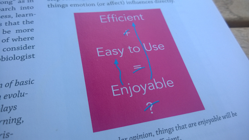
I found particularly interesting the idea that “contrary to popular opinion, things that are enjoyable will be perceived as easy to use and efficient”, that is, instead of thinking, an easy to use and efficient application is enjoyable, you invert the cause and the effect. It does make sense if you think of it. (That’s one of the things I love about reading, it estimulates active and intentional thinking and reflecting, reading FTW!)

- Playful Seduction continues the trip into seduction-land through the idea of playfulness. In life, we use playful behaviors to entice others, behaviors such as humor, surprise or being misterious, all of these can be translated to the interactions we have with our users in our applications so they become more vibrant, more alive. And here goes an example from Southwest airlines where they use humor to provide that little extra bit that makes the experience more memorable:
In the event of a sudden loss of cabin pressure, oxygen masks will descend from the ceiling. Stop screaming, grab the mask, and pull it over your face. If you have a small child traveling with you, secure your mask before assisting with theirs. If you are traveling with two small children, decide now which one you love more.
Ladies and gentlemen, if you wish to smoke, the smoking section on this airplane is on the wing and if you can light’em, you can smoke’em.
There may be 50 ways to leave your lover, but there are only four ways out of this aircraft.
Hilarious. Can you see how leveraging playfulness can improve the connection between your users and the applications you develop?
- The Subtle Art of Seduction guides us towards using subtlety, being suggestive, nudging our users in almost unperceptible ways to the desired behavior. An example of this can be found in Get Satisfaction:
(…) At one point you may have asked: “How can we get people to complete the requested information or add more written information in a text field?” The customer feedback app Get Satisfaction has an elegant way to nudge people into providing more information. With Get Satisfaction, you can share ideas, questions, problems or praise for a site or service your’re using.
Here’s the neat part: They estimate the likelihood of your post getting noticed based on how many fields you complete and how much text you type in each field. This strength meter is a real-time feedback loop.
(…) If I include more information, like additional details and some tags, then the strength meter goes up. If I add my feelings about it, the strength meter climbs higher still. So, it’s giving me that feedback and letting me know “Hey, we think you should add more information here”.
- The Game of Seduction explores how to use game mechanics to keep our users hooked to our application in the long term. Within its pages, Steven details how to distill/reveal the challenges (the fun part) from your application and leverage these together with conflicts, choices, feedback loops, goals and rewards in order to create compelling and fun applications. And he does so by applying these game mechanics to the design of an email client, which makes for an excellent example that you can yourself use when applying this principle in your work. This is probably my favorite part of the book in addition to all the psychology principles.
3 Things I Have Learned From This Book
There’s a host of things I learned from this book, and even more ideas that I have found earlier in other literature which have been either reinforced or tackled from other interesting angles. Here are the three that were the most memorable to me (I usually take notes on the books themselves while a read them, but this one being borrowed I had to refrain myself and thus, these 3 points may not be the very best or the most interesting ones):
Awesome Thingy #1. The Status Quo Bias
Given a choice between action or inaction, we choose inaction, we do nothing. Given two choices, we tend to choose the one that doesn’t require us to do anything. This is what is known as the status quo bias. If you think about it for a minute you will recognize this behavior in yourself, think about every time you sign up for a free month subscription and then neglect to cancel it, or how you always choose to run in the same treadmill at the gym, or use the same locker in the changing rooms, that my friend is status quo bias in action.
Knowing the existence of this bias can help you leverage it to help your users when developing applications and in real life. Think about the use of good defaults or suggestions that nudge your users in the right direction. Think about understanding when the bias - the lizard brain - kicks in and saying: “No! I am going to break the status quo, get outside of my comfort zone and kick butt“.
The status quo bias is very related to other two interesting ideas in behavioral economics, the ownership bias (also known as the endownment effect) - we assign more value to things that we ourselves own- and loss aversion - we hate to lose stuff.
Interesting stuff right? Can you think about ways in which you could leverage this?
Awesome thingy #2. Bridging The Gap Between UX and Business. Connecting Behavior Goals With Business Goals
From my experience in software development so far, there’s usually a big gap between fulfilling business goals and User Experience. Oftentimes businesses struggle to understand the importance of User Experience and struggle even more when trying to incorporate User Experience into their software development process.
Seductive Interaction Design provides an interesting take on this by providing the following heuristic:
- Identify Business Goal: “What does successful look like?”
- for instance Improve the quality of the video content uploaded to YouTube
- Identify which behaviors support this goal
- Encourage people to be more selective about what they upload
- Design your application to encourage this behaviors and attain the business goal
- Limit the number of uploads to just a few per week. This will encourage people to upload only their best content
- Give more editing features to people that uploads HD content
- Start challenging users to include cinematic techniques in the videos. This would, in time, improve YouTube users video production abilities and thus the content they upload to the site.
This was super interesting to me because I have never thought about developing applications in these terms. I usually think in a smaller scale, designing to help the user fulfill a particular need but at a much smaller scale, like what is the user trying to achieve in this particular view? and How can I make it as easy and pleasurable as possible?.
I will definitely remember this in the future.
Awesome thingy #3. Mind Your Product Personality
Every product has a personality and we people are deeply affected by that:
- We identify and avoid certain personalities
- We trust based on personality
- Perception and expectations are linked to personality
- We choose products that are an extension of ourselves
- We treat advanced technology as though it were human
Mental note: Mind your product personality, does it appeal to your target audience? Is it consistent?
In Closing. Wholeheartedly Recommend This Book
And that was it. I don’t have the slightest idea how this article exploded as it did. If you’ve come this far, I really hope you have enjoyed it and that it has piqued your curiosity regarding the book.
Other Interesting Related Reads
Throughout the book, the author offers numerous references to other interesting books and sources. Below are those that I found the most interesting:

Written by Jaime González García , dad, husband, software engineer, ux designer, amateur pixel artist, tinkerer and master of the arcane arts. You can also find him on Twitter jabbering about random stuff.
