Lean UX, Atomic Design And Angular - A Flexible Front-End Architecture For Developing Web Applications: Part III

In the last two articles part of this series I discussed the need for a flexible front-end architecture that lets us adapt to changing UX requirements and how Lean UX techniques play well with modern agile software development practices and can drive this changing requirements through experiments and learning. The next step is to implement such an architecture in Angular.
Angular promotes an MVC architecture of nested controllers (and nested scopes) where the data naturally flows from parent to child. In this type of architecture parent controllers can easily flow data into child controllers but the vice versa, flowing data upwards, is not as straightforward. Moreover flowing data and interacting between siblings becomes even harder nugging you to use a parent or a specific service as a means of communication. Even though each controller naturally lends itself to encapsulate a piece of functionality, it is still very dependent of its surroundings and moving it around or altering the layout of a given view usually results in needing to change a lot of code.
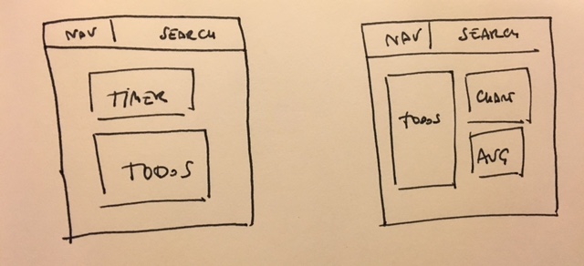
Let’s illustrate these limitations with an example. Imagine that we want to become uber productive and we start building a pomodoro technique web app. We want this app main view to have a timer and a collection of tasks. It could look like this:
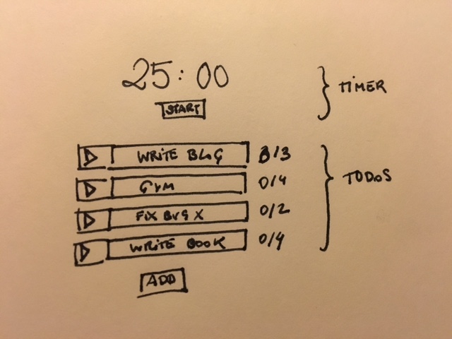
The idea is that you would be able to:
- add/remove tasks,
- estimate how many pomodoros each task would take
- select which tasks you work on
- start/stop the timer (which would update the status of the task being executed)
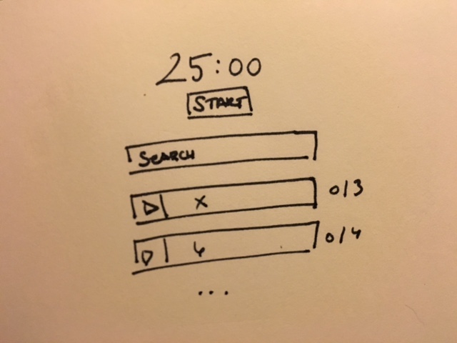
Later in time, after we’ve been using the app for some time, managing tasks becomes unwieldy and we want to add a search/filter functionality. So we decide to add a search field in our current view to filter our tasks:
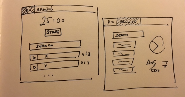
After a while we decide that our app would be even better if we could archive tasks and be able to see a historic view with some metrics regarding our performance so we create a separate view to display such information.
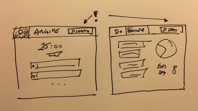
We also want to be more consistent with the search/filter functionality within the app so we move it to the header’s top right corner:
Now imagine the different ways in which you could’ve built this app and how each would’ve lent itself to the coming needs of the user:
- A monolithic app
- Controllers encapsulating functionality
- Components: Custom Directives with attributes as a mean of interaction
- Isolated components: Completely isolated directives communicating only through a pub/sub mechanism
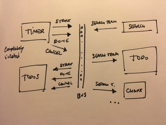
That last option is what this series proposes, a web application as a family of components. Each component as a completely independent unit and encapsulating all its functionality within itself. Each component providing a series of services to other components and consuming services from other components in a completely loosely coupled way through messages/events.
Using this approach we could see the pomodoro app as follows:
Every component is completely isolated and only communicates through a bus publishing/subscribing messages:
Which would result in a very semantic and domain specific markup:
<pomodoro-app/><pomodoro-header/>
<ng-view><nav>
<!-- navigation here -->
</nav>
<search-tasks><pomodoro-timer/>
<pomodoro-tasks/><pomodoro-tasks/>
<pomodoro-chart/>
<pomodoro-average-speed/>In this context, moving the search field to the header of the page (or anything else for that matter) would be completely straightforward. Each component lives in complete isolation, it renders itself, it obtains the information it needs by itself, and if it breaks for some reason it will not affect other components. Each component also constitutes a completely encapsulated and reusable piece of functionality that can be composed with other components to form more complex composite components and user interfaces.
This approach of viewing websites and web applications as a collection of components is very well described in Atomic Design where components of different degrees of complexity are called atoms, molecules and organisms:
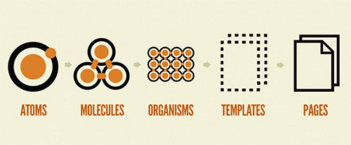
Atoms are the most basic of components which can correspond to html elements like inputs, buttons, labels. Molecules are composed by atoms and provide some very specific functionality, for instance, a search field accompanied of a button. Organisms are, in turn, composed of molecules and can represent more complex components or even entire parts of a website like a header with navigation, search, etc. Organisms put together form templates than when provided with specific information become pages.
This type of component based design is also encouraged in Lean UX which promotes the development of a common style guide and component library. Using a shared style guide for an organization or project improves reusability, increases the consistency between the different views that form a web application and encourages the communication between the different teams. It can also ensure that a unified brand is used across different products.
In the next article we will dive into the codez! I’ll start with a monolithic app and I’ll go implementing the different features, I’ll then repeat the process after factoring the code in controllers and components. This way we’ll be able to compare the relative ease of change of either approach. In later articles we will also discuss how to best approach the design of these components using CSS (or SASS).
Have a great day!

Written by Jaime González García , dad, husband, software engineer, ux designer, amateur pixel artist, tinkerer and master of the arcane arts. You can also find him on Twitter jabbering about random stuff.
